

	<!--IFTS_NO_PARSE-->
	<!--multilang_start-->


	<!--slot:mw_default_start-->


			<div id="slot_0_0" class="uslot    ">


<section class="content-slot uslot1">
	<div class="col-lg-12 col-md-12 col-sm-12 col-xs-12 pull-left nospacing">
		<!--flexmodul: bild-->


<style>

#flex_0_0_100_0{
	margin-bottom: 30px;
}


#flex_0_0_100_0 > div::after {
	clear: both;
	display: block;
	content: "";
}

#flex_0_0_100_0 .bild{
<!-- height: 185px; -->
}


@media (min-width: 1187px) {


#flex_0_0_100_0{

				margin-top: 0px;

				margin-right: 0px;

				margin-bottom: 90px;

				margin-left: 0px;


				padding-top: 0px;

				padding-right: 0px;

				padding-bottom: 0px;

				padding-left: 0px;
		}


}

@media (min-width: 992px) and (max-width: 1188px) {


#flex_0_0_100_0{

				margin-top: 0px;

				margin-right: 0px;

				margin-bottom: 60px;

				margin-left: 0px;


				padding-top: 0px;

				padding-right: 0px;

				padding-bottom: 0px;

				padding-left: 0px;
		}


}

@media (min-width: 600px) and (max-width: 992px) {


#flex_0_0_100_0{

				margin-top: 0px;

				margin-right: 0px;

				margin-bottom: 120px;

				margin-left: 0px;


				padding-top: 0px;

				padding-right: 0px;

				padding-bottom: 0px;

				padding-left: 0px;
		}


}

@media (max-width: 600px) {


#flex_0_0_100_0 .bild img{
		width: 100%;
	}


#flex_0_0_100_0{

				margin-top: 0px;

				margin-right: 0px;

				margin-bottom: 60px;

				margin-left: 0px;


				padding-top: 0px;

				padding-right: 0px;

				padding-bottom: 0px;

				padding-left: 0px;
		}


}

@media (min-width: 580px) {


#flex_0_0_100_0 .pull-left.bild{
		padding-right: 4px ! important;
	}

#flex_0_0_100_0 .pull-right.bild{
		padding-left: 4px ! important;
	}

#flex_0_0_100_0 .pull-right.content{
		padding-left: 10px ! important;
	}

#flex_0_0_100_0 .pull-left.content{
		padding-right: 10px ! important;
	}

}

@media (max-width: 580px) {
#flex_0_0_100_0 .pull-left.bild img{
		padding-bottom: 15px;
	}

#flex_0_0_100_0 .content > div{
		padding-bottom: 30px;
	}

#flex_0_0_100_0 .pull-left.bild img{
		padding-bottom: 15px;
	}


}

</style>


<section class="content-bild   " id="flex_0_0_100_0"  style="">
	<div class="col-lg-12 col-md-12 col-sm-12 col-xs-12 pull-left nospacing">
		<div class="col-lg-8 col-md-8 col-sm-8 col-xs-12 pull-left nospacing content">
			<p>Der Name ist Programm. Verschiedene Angebote sollen helfen, den ganz eigenen musikalischen Weg zu finden und wom&ouml;glich auch das jeweilige Traum-Instrument.<br />
<br />
In der <em><strong>Singklasse</strong> </em>werden altersgerechte Lieder gesungen, ausgehend vom nat&uuml;rlichen Umfang der gesunden Kinderstimme mit allm&auml;hlicher Ausweitung des Stimmumfangs. Spielerische Stimmbildungs&uuml;bungen, Bewegung als Grundlage f&uuml;r ein gutes K&ouml;rpergef&uuml;hl beim Singen, Geh&ouml;r- und Rhythmusschulung als Vorbereitung nicht nur f&uuml;rs Singen, sondern auch f&uuml;r das Instrumentalspiel.</p>

<p>Ab der 2. Schulklasse wird das Programm im <strong>Kinderchor </strong>weiter ausgebaut.<br />
<br />
Du m&ouml;chtest mit unterschiedlichen Instrumenten experimentieren, um herauszufinden, was dein Lieblingsinstrument ist? Dann ist das Modell <strong><i>Probier mal 4</i></strong> genau das Richtige. Vier Mal wechselst du im Laufe eines Jahres das Instrument, um mit Gleichgesinnten herauszufinden, wo deine Vorlieben liegen. Die Instrumente werden zur Verf&uuml;gung gestellt und k&ouml;nnen auch zum &Uuml;ben mit nach Hause genommen werden (ausgenommen schwere Instrumente wie Klavier oder Harfe).
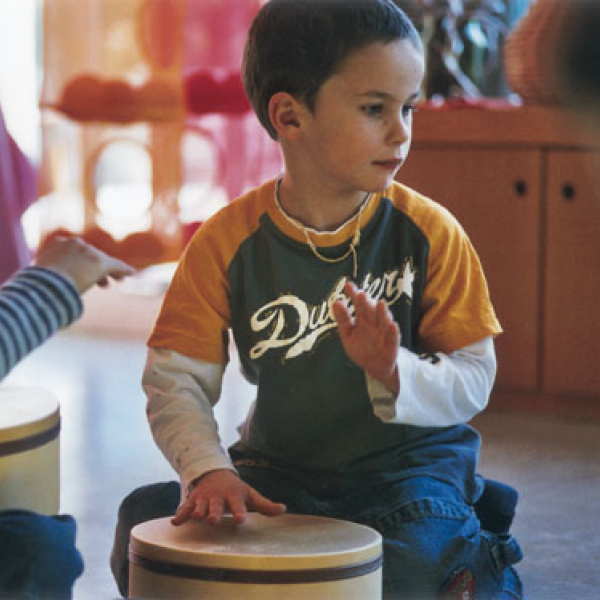
</p>

<p>Die<strong> <em>&quot;First Band&quot; </em></strong>ist perfekt f&uuml;r Dein erstes Zusammenspiel in der Gruppe. Im Laufe eines Kalenderjahres hast Du hier die M&ouml;glichkeit, verschiedene Instrumentengruppen kennenzulernen- Trommeln/Rhythmus, Tasten- und Blasinstrumente werden abwechselnd erlernt und gemeinsam arrangiert. Die Stunde beginnt mit einem stimmlichen Warm-Up, danach wird am Instrument ge&uuml;bt und zum Ende der Stunde wird das erarbeitete Lied gemeinsam als Band gespielt. Jeder Teilnehmer und jede Teilnehmerin spielt im viertelj&auml;hrlichen Wechsel jede Instrumentengruppe und ist dann nach 12 Monaten fit f&uuml;r die <em><strong>&quot;First Band&quot;</strong></em>.</p>

<p><br />
Nat&uuml;rlich unterst&uuml;tzen wir dich auch jederzeit mit einer ausf&uuml;hrlichen Beratung im Sekretariat und bei den Lehrkr&auml;ften direkt. Hier kannst du nach Absprache in den Unterricht hineinschauen und einen ersten Eindruck bekommen, wie &bdquo;das Ganze so l&auml;uft&ldquo;. Wir unterst&uuml;tzen dich auf deiner ganz eigenen musikalischen Reise.</p>

		</div>
		<div class="col-lg-4 col-md-4 col-sm-4 col-xs-12 pull-right nospacing bild   " >
			<figure>

				<img src="/mb/mw/musikschule/fotos/fittosize_600_600_314_78_10add17fa05c44adaad30e5bd98c528e_6_monate_bis_6_jahre_4.jpg" class="img-responsive" title="" alt="Kinder trommeln">
				<figcaption>
					 © ESM
				</figcaption>

			</figure>
		</div>


	</div>
	<div class="clearfix"></div>
</section>


<div class="clearfix"></div>


<!--/flexmodul: bild-->
<!--flexmodul: wordmodul_mit_bild-->


<style>

#flex_0_0_100_2{
	margin-bottom: 30px;
}


#flex_0_0_100_2{
	background-color: rgba(255,255,255,1);

}


@media (min-width: 1187px) {


#flex_0_0_100_2{

				margin-top: 0px;

				margin-right: 0px;

				margin-bottom: 60px;

				margin-left: 0px;


				padding-top: 15px;

				padding-right: 15px;

				padding-bottom: 30px;

				padding-left: 15px;
		}


}

@media (min-width: 992px) and (max-width: 1188px) {


#flex_0_0_100_2{

				margin-top: 0px;

				margin-right: 0px;

				margin-bottom: 60px;

				margin-left: 0px;


				padding-top: 15px;

				padding-right: 15px;

				padding-bottom: 30px;

				padding-left: 15px;
		}


}

@media (min-width: 600px) and (max-width: 992px) {


#flex_0_0_100_2{

				margin-top: 0px;

				margin-right: 0px;

				margin-bottom: 60px;

				margin-left: 0px;


				padding-top: 15px;

				padding-right: 15px;

				padding-bottom: 30px;

				padding-left: 15px;
		}


}

@media (max-width: 600px) {


#flex_0_0_100_2 .bild img{
		width: 100%;
	}


#flex_0_0_100_2{

				margin-top: 0px;

				margin-right: 0px;

				margin-bottom: 60px;

				margin-left: 0px;


				padding-top: 15px;

				padding-right: 15px;

				padding-bottom: 30px;

				padding-left: 15px;
		}


}


</style>

<style>
#flex_0_0_100_2 table, #flex_0_0_100_2 div{
	position:relative;
}

#flex_0_0_100_2 div.tablediv.tabelleNachRechts:after{
	    content: '';
    display: block;
    background: rgb(2,0,36);
background: linear-gradient(-90deg, rgba(2,0,36,0.3) 0%, rgba(255,255,255,0) 100%);
    height: 100%;
    width: 10px;
    position: absolute;
    top: 0;
    right: 0;
	z-index: 100;
}

#flex_0_0_100_2 div.tablediv.tabelleNachLinks:before{
	    content: '';
    display: block;
    background: rgb(2,0,36);
background: linear-gradient(90deg, rgba(2,0,36,0.3) 0%, rgba(255,255,255,0) 100%);
    height: 100%;
    width: 10px;
    position: absolute;
    top: 0;
    left: 0;
	z-index: 100;
}
</style>


<!--/flexmodul: wordmodul_mit_bild-->

	</div>
</section>


</div>


	<style>


	#slot_0_0{
		position: relative;
	}

	@media (min-width: 1187px) {


}

@media (min-width: 992px) and (max-width: 1188px) {


}

@media (min-width: 600px) and (max-width: 992px) {


}

@media (max-width: 600px) {


}

	</style>

<style>

</style>


	<!--slot:mw_default-->


		<!--IFTS_NO_PARSE-->
		<!--multilang_end-->


