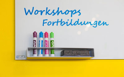

	<!--IFTS_NO_PARSE-->
	<!--multilang_start-->


	<!--slot:mw_default_start-->


			<div id="slot_0_0" class="uslot    ">


<section class="content-slot uslot1">
	<div class="col-lg-12 col-md-12 col-sm-12 col-xs-12 pull-left nospacing">
		<!--flexmodul: bild-->


<style>

#flex_0_0_100_0{
	margin-bottom: 30px;
}


#flex_0_0_100_0 > div::after {
	clear: both;
	display: block;
	content: "";
}

#flex_0_0_100_0 .bild{
<!-- height: 185px; -->
}


@media (min-width: 1187px) {


#flex_0_0_100_0{

				margin-top: 0px;

				margin-right: 0px;

				margin-bottom: 60px;

				margin-left: 0px;


				padding-top: 0px;

				padding-right: 0px;

				padding-bottom: 0px;

				padding-left: 0px;
		}


#flex_0_0_100_0 .bild figure{


				padding-top: 0px ! important;

				padding-right: 0px ! important;

				padding-bottom: 0px ! important;

				padding-left: 0px ! important;
		}


}

@media (min-width: 992px) and (max-width: 1188px) {


#flex_0_0_100_0{

				margin-top: 0px;

				margin-right: 0px;

				margin-bottom: 60px;

				margin-left: 0px;


				padding-top: 0px;

				padding-right: 0px;

				padding-bottom: 0px;

				padding-left: 0px;
		}


#flex_0_0_100_0 .bild figure{


				padding-top: 0px ! important;

				padding-right: 0px ! important;

				padding-bottom: 0px ! important;

				padding-left: 0px ! important;
		}


}

@media (min-width: 600px) and (max-width: 992px) {


#flex_0_0_100_0{

				margin-top: 0px;

				margin-right: 0px;

				margin-bottom: 60px;

				margin-left: 0px;


				padding-top: 0px;

				padding-right: 0px;

				padding-bottom: 0px;

				padding-left: 0px;
		}


#flex_0_0_100_0 .bild figure{


				padding-top: 0px ! important;

				padding-right: 0px ! important;

				padding-bottom: 0px ! important;

				padding-left: 0px ! important;
		}


}

@media (max-width: 600px) {


#flex_0_0_100_0 .bild img{
		width: 100%;
	}


#flex_0_0_100_0{

				margin-top: 0px;

				margin-right: 0px;

				margin-bottom: 60px;

				margin-left: 0px;


				padding-top: 0px;

				padding-right: 0px;

				padding-bottom: 0px;

				padding-left: 0px;
		}


#flex_0_0_100_0 .bild figure{


				padding-top: 15px ! important;

				padding-right: 0px ! important;

				padding-bottom: 0px ! important;

				padding-left: 0px ! important;
		}


}

@media (min-width: 580px) {


#flex_0_0_100_0 .pull-left.bild{
		padding-right: 4px ! important;
	}

#flex_0_0_100_0 .pull-right.bild{
		padding-left: 4px ! important;
	}

#flex_0_0_100_0 .pull-right.content{
		padding-left: 10px ! important;
	}

#flex_0_0_100_0 .pull-left.content{
		padding-right: 10px ! important;
	}

}

@media (max-width: 580px) {
#flex_0_0_100_0 .pull-left.bild img{
		padding-bottom: 15px;
	}

#flex_0_0_100_0 .content > div{
		padding-bottom: 30px;
	}

#flex_0_0_100_0 .pull-left.bild img{
		padding-bottom: 15px;
	}


}

</style>


<section class="content-bild   " id="flex_0_0_100_0"  style="">
	<div class="col-lg-12 col-md-12 col-sm-12 col-xs-12 pull-left nospacing">
		<div class="col-lg-8 col-md-8 col-sm-8 col-xs-12 pull-left nospacing content">
			<p>Die Musikakademie als sinnvolle Erg&auml;nzung zu dem Angebot der Musikschule ist insbesondere auf die Bereiche <i>Workshops und Fortbildungen</i> und <i>Stipendien</i> f&uuml;r besonders Begabte spezialisiert. Zus&auml;tzlich ist der <i><strong>PLAYGROUND</strong></i> als musik- und erlebnisp&auml;dagogische Werkstatt f&uuml;r Kinder und Jugendliche im Angebot. Mit zahlreichen w&ouml;chentlichen Kursen sowie Freizeiten wird ein offener Zugang zur Musik erm&ouml;glicht &ndash; dank F&ouml;rdergeldern vollkommen geb&uuml;hrenfrei. Hier wird das Motto &bdquo;Kultur f&uuml;r alle&ldquo; gelebt und spannende, kreative Projektarbeit mit hohem Erlebnisfaktor erm&ouml;glicht.<br />
<br />
An besonders talentierte und engagierte Sch&uuml;lerinnen und Sch&uuml;ler unserer Schule vergibt die Musikakademie <i>Stipendien</i> und stellt somit eine Schnittstelle zwischen Musikschule und Musikhochschule dar. Die <i>Workshops und Fortbildungen</i> stehen allen offen und bieten sowohl Lernenden als auch Lehrenden ein hochwertiges und vielf&auml;ltiges Programm an. So ist die Musikakademie ein Weiterbildungszentrum f&uuml;r die gesamte Region.</p>

		</div>
		<div class="col-lg-4 col-md-4 col-sm-4 col-xs-12 pull-right nospacing bild   " >
			<figure>
				<img src="/mb/mw/musikschule/fotos/instrumente/guitar-3283649_19202.jpg" class="img-responsive only-xs" title="" alt="Gitarre">
				<figcaption class="not-xs">
					 
				</figcaption>

				<img src="/mb/themen/kultur/musik_und_unterhaltung/musikschule/testrubrik/fittosize_600_600_960_595_4c814d40230d56a148889211e4735901_guitar-3283649_1920.jpg" class="img-responsive not-xs" title="" alt="">
				<figcaption class="not-xs">
					 
				</figcaption>

			</figure>
		</div>


	</div>
	<div class="clearfix"></div>
</section>


<div class="clearfix"></div>


<!--/flexmodul: bild-->
<!--flexmodul: wordmodul_mit_bild-->


<style>

#flex_0_0_100_2{
	margin-bottom: 30px;
}


#flex_0_0_100_2, #flex_0_0_100_2 a{
	color: rgb(168, 5, 9);
}


@media (min-width: 1187px) {


}

@media (min-width: 992px) and (max-width: 1188px) {


}

@media (min-width: 600px) and (max-width: 992px) {


}

@media (max-width: 600px) {


#flex_0_0_100_2 .bild img{
		width: 100%;
	}


}

</style>


<section class="content-ueberschrift   " id="flex_0_0_100_2"  style="text-align: left; ">


<h2>
Unsere Angebote
</h2>


</section>


<!--/flexmodul: wordmodul_mit_bild-->

	</div>
</section>


</div>


	<style>


	#slot_0_0{
		position: relative;
	}

	@media (min-width: 1187px) {


}

@media (min-width: 992px) and (max-width: 1188px) {


}

@media (min-width: 600px) and (max-width: 992px) {


}

@media (max-width: 600px) {


}

	</style>

<style>

</style>


			<div id="slot_0_2" class="uslot    ">


<section class="content-slot content-slot3 uslot3">
	<div class="col-lg-4 col-md-4 col-sm-4 col-xs-12 pull-left">
		<!--flexmodul: bild-->


<style>

#flex_0_2_100_1{
	margin-bottom: 30px;
}


@media (min-width: 1187px) {


#flex_0_2_100_1{

		margin-top: 0px;

		margin-right: 0px;

		margin-bottom: 60px;

		margin-left: 0px;


		padding-top: 0px;

		padding-right: 0px;

		padding-bottom: 0px;

		padding-left: 0px;
}

}

@media (min-width: 992px) and (max-width: 1188px) {

#flex_0_2_100_1{

				margin-top: 0px;

				margin-right: 0px;

				margin-bottom: 60px;

				margin-left: 0px;


				padding-top: 0px;

				padding-right: 0px;

				padding-bottom: 0px;

				padding-left: 0px;
		}


}

@media (min-width: 600px) and (max-width: 992px) {


#flex_0_2_100_1{

				margin-top: 0px;

				margin-right: 0px;

				margin-bottom: 60px;

				margin-left: 0px;


				padding-top: 0px;

				padding-right: 0px;

				padding-bottom: 0px;

				padding-left: 0px;
		}


}

@media (max-width: 600px) {


#flex_0_2_100_1{

				margin-top: 0px;

				margin-right: 0px;

				margin-bottom: 30px;

				margin-left: 0px;


				padding-top: 0px;

				padding-right: 0px;

				padding-bottom: 0px;

				padding-left: 0px;
		}

}


}


#flex_0_2_100_1 section {
    background-color: white;
    padding: 30px 15px;
    border-bottom: 15px solid rgba(189,15,19,1);
}


#flex_0_2_100_1 section{
background-color: white;
padding: 30px 15px;
border-bottom: 15px solid rgb(168, 5, 9);
}

#flex_0_2_100_1 section h3{
	margin-top: 0;
	padding-top: 0;
	text-align: center;
	color: rgb(168, 5, 9);
	font-size: 1.5em;
}

#flex_0_2_100_1 {
	box-shadow: 0px 1px 10px rgba(0,0,0,0.2);
}


@media (min-width: 1187px) {

#flex_0_2_100_1 header{
		width: 100%;
		height: auto;
		min-height: 80px;
	}

#flex_0_2_100_1 .circle_background {

	  height: 105px;
	  width: 25%;

	  background-color: #fff;
	  border-radius: 50%;
	  display: inline-block;
	  left: 50%;
	  margin-left: -12.5%;
	  margin-top: -40px;
	}

#flex_0_2_100_1 .circle_foreground {
	  height: 93px;
	  width: 22%;
	  background-color: rgb(168, 5, 9);
	  border-radius: 50%;
	  display: inline-block;
	  left: 50%;
	  margin-left: -11%;
	  margin-top: -34px;
	  text-align: center;
	}


#flex_0_2_100_1 .circle_foreground i{
	  position: relative;
	  font-size: 3.0em;
	  color: white;
	  margin-top: 28px;
	}
}

@media (min-width: 992px) and (max-width: 1188px) {

#flex_0_2_100_1 header{
		width: 100%;
		height: auto;
		min-height: 80px;
	}

#flex_0_2_100_1 .circle_background {

	  height: 8.9vw;
	  width: 8.9vw;

	  background-color: #fff;
	  border-radius: 50%;
	  display: inline-block;
	  left: 50%;
	  margin-left: -4.45vw;
	 margin-top: -3.55vw;
	}

#flex_0_2_100_1 .circle_foreground {
	  height: 7.9vw;
	  width: 7.9vw;
	  background-color: rgb(168, 5, 9);
	  border-radius: 50%;
	  display: inline-block;
	  left: 50%;
	  margin-left: -3.95vw;
	  margin-top: -3.05vw;
	  text-align: center;
	}


#flex_0_2_100_1 .circle_foreground i{
	  position: relative;
	  font-size: 3.7vw;
	  color: white;
	  margin-top: 2.6vw;
	  <!-- margin-top: 28px; -->
	}
}


@media (min-width: 600px) and (max-width: 992px) {

#flex_0_2_100_1 header{
		width: 100%;
		height: auto;
	}

#flex_0_2_100_1 .circle_background {

	  height: 8.9vw;
	  width: 8.9vw;

	  background-color: #fff;
	  border-radius: 50%;
	  display: inline-block;
	  left: 50%;
	  margin-left: -4.45vw;
	 margin-top: -2.55vw;
	}

#flex_0_2_100_1 .circle_foreground {
	  height: 7.9vw;
	  width: 7.9vw;
	  background-color: rgb(168, 5, 9);
	  border-radius: 50%;
	  display: inline-block;
	  left: 50%;
	  margin-left: -3.95vw;
	  margin-top: -2.05vw;
	  text-align: center;
	}


#flex_0_2_100_1 .circle_foreground i{
	  position: relative;
	  font-size: 3.7vw;
	  color: white;
	  margin-top: 2.6vw;
	  <!-- margin-top: 28px; -->
	}
}


@media (max-width: 600px) {

#flex_0_2_100_1 header{
		width: 100%;
		height: auto;
	}

#flex_0_2_100_1 .circle_background {

	  height: 12.9vw;
	  width: 12.9vw;

	  background-color: #fff;
	  border-radius: 50%;
	  display: inline-block;
	  left: 50%;
	  margin-left: -6.45vw;
	 margin-top: -4.55vw;
	}

#flex_0_2_100_1 .circle_foreground {
	  height: 11.0vw;
	  width: 11.0vw;
	  background-color: rgb(168, 5, 9);
	  border-radius: 50%;
	  display: inline-block;
	  left: 50%;
	  margin-left: -5.5vw;
	  margin-top: -3.7vw;
	  text-align: center;
	}


#flex_0_2_100_1 .circle_foreground i{
	  position: relative;
	  font-size: 5.0vw;
	  color: white;
	  margin-top: 3.6vw;
	  <!-- margin-top: 28px; -->
	}

}


#flex_0_2_100_1 header{
	background-size: cover;
	background-color: rgb(168, 5, 9);
}

a.flex_0_2_100_1 {
text-decoration: none;
color: rgb(51, 51, 51);
}


</style>


	<a href="/musikschule/musikakademie/playground/index.html.de" target="_self" class="flex_0_2_100_1">

<section class="content-bild content-card   " id="flex_0_2_100_1"  style="">

<header style="position: relative;">
	<figure>
		<div>
			<img src="/mb/mw/musikschule/fotos/navigation/playground.jpg" style="width: 100%;" alt="Playground - eine Gruppe Musikerinnen und Musiker">

		</div>
	</figure>
</header>
<section>
<h3>PLAYGROUND</h3>
<p>Du willst an spannenden Projekten zu Musik, Kunst und Tanz f&uuml;r Kinder und Jugendliche mitmachen? Dann werde Teil des PLAYGROUND!</p>

</section>

</section>

	</a>


<!--/flexmodul: bild-->

	</div>
		<div class="col-lg-4 col-md-4 col-sm-4 col-xs-12 pull-left">
		<!--flexmodul: bild-->


<style>

#flex_0_2_200_0{
	margin-bottom: 30px;
}


@media (min-width: 1187px) {


#flex_0_2_200_0{

		margin-top: 0px;

		margin-right: 0px;

		margin-bottom: 60px;

		margin-left: 0px;


		padding-top: 0px;

		padding-right: 0px;

		padding-bottom: 0px;

		padding-left: 0px;
}

}

@media (min-width: 992px) and (max-width: 1188px) {

#flex_0_2_200_0{

				margin-top: 0px;

				margin-right: 0px;

				margin-bottom: 60px;

				margin-left: 0px;


				padding-top: 0px;

				padding-right: 0px;

				padding-bottom: 0px;

				padding-left: 0px;
		}


}

@media (min-width: 600px) and (max-width: 992px) {


#flex_0_2_200_0{

				margin-top: 0px;

				margin-right: 0px;

				margin-bottom: 60px;

				margin-left: 0px;


				padding-top: 0px;

				padding-right: 0px;

				padding-bottom: 0px;

				padding-left: 0px;
		}


}

@media (max-width: 600px) {


#flex_0_2_200_0{

				margin-top: 0px;

				margin-right: 0px;

				margin-bottom: 30px;

				margin-left: 0px;


				padding-top: 0px;

				padding-right: 0px;

				padding-bottom: 0px;

				padding-left: 0px;
		}

}


}


#flex_0_2_200_0 section {
    background-color: white;
    padding: 30px 15px;
    border-bottom: 15px solid rgba(189,15,19,1);
}


#flex_0_2_200_0 section{
background-color: white;
padding: 30px 15px;
border-bottom: 15px solid rgba(185,104,5,1);
}

#flex_0_2_200_0 section h3{
	margin-top: 0;
	padding-top: 0;
	text-align: center;
	color: rgba(185,104,5,1);
	font-size: 1.5em;
}

#flex_0_2_200_0 {
	box-shadow: 0px 1px 10px rgba(0,0,0,0.2);
}


@media (min-width: 1187px) {

#flex_0_2_200_0 header{
		width: 100%;
		height: auto;
		min-height: 80px;
	}

#flex_0_2_200_0 .circle_background {

	  height: 105px;
	  width: 25%;

	  background-color: #fff;
	  border-radius: 50%;
	  display: inline-block;
	  left: 50%;
	  margin-left: -12.5%;
	  margin-top: -40px;
	}

#flex_0_2_200_0 .circle_foreground {
	  height: 93px;
	  width: 22%;
	  background-color: rgba(185,104,5,1);
	  border-radius: 50%;
	  display: inline-block;
	  left: 50%;
	  margin-left: -11%;
	  margin-top: -34px;
	  text-align: center;
	}


#flex_0_2_200_0 .circle_foreground i{
	  position: relative;
	  font-size: 3.0em;
	  color: white;
	  margin-top: 28px;
	}
}

@media (min-width: 992px) and (max-width: 1188px) {

#flex_0_2_200_0 header{
		width: 100%;
		height: auto;
		min-height: 80px;
	}

#flex_0_2_200_0 .circle_background {

	  height: 8.9vw;
	  width: 8.9vw;

	  background-color: #fff;
	  border-radius: 50%;
	  display: inline-block;
	  left: 50%;
	  margin-left: -4.45vw;
	 margin-top: -3.55vw;
	}

#flex_0_2_200_0 .circle_foreground {
	  height: 7.9vw;
	  width: 7.9vw;
	  background-color: rgba(185,104,5,1);
	  border-radius: 50%;
	  display: inline-block;
	  left: 50%;
	  margin-left: -3.95vw;
	  margin-top: -3.05vw;
	  text-align: center;
	}


#flex_0_2_200_0 .circle_foreground i{
	  position: relative;
	  font-size: 3.7vw;
	  color: white;
	  margin-top: 2.6vw;
	  <!-- margin-top: 28px; -->
	}
}


@media (min-width: 600px) and (max-width: 992px) {

#flex_0_2_200_0 header{
		width: 100%;
		height: auto;
	}

#flex_0_2_200_0 .circle_background {

	  height: 8.9vw;
	  width: 8.9vw;

	  background-color: #fff;
	  border-radius: 50%;
	  display: inline-block;
	  left: 50%;
	  margin-left: -4.45vw;
	 margin-top: -2.55vw;
	}

#flex_0_2_200_0 .circle_foreground {
	  height: 7.9vw;
	  width: 7.9vw;
	  background-color: rgba(185,104,5,1);
	  border-radius: 50%;
	  display: inline-block;
	  left: 50%;
	  margin-left: -3.95vw;
	  margin-top: -2.05vw;
	  text-align: center;
	}


#flex_0_2_200_0 .circle_foreground i{
	  position: relative;
	  font-size: 3.7vw;
	  color: white;
	  margin-top: 2.6vw;
	  <!-- margin-top: 28px; -->
	}
}


@media (max-width: 600px) {

#flex_0_2_200_0 header{
		width: 100%;
		height: auto;
	}

#flex_0_2_200_0 .circle_background {

	  height: 12.9vw;
	  width: 12.9vw;

	  background-color: #fff;
	  border-radius: 50%;
	  display: inline-block;
	  left: 50%;
	  margin-left: -6.45vw;
	 margin-top: -4.55vw;
	}

#flex_0_2_200_0 .circle_foreground {
	  height: 11.0vw;
	  width: 11.0vw;
	  background-color: rgba(185,104,5,1);
	  border-radius: 50%;
	  display: inline-block;
	  left: 50%;
	  margin-left: -5.5vw;
	  margin-top: -3.7vw;
	  text-align: center;
	}


#flex_0_2_200_0 .circle_foreground i{
	  position: relative;
	  font-size: 5.0vw;
	  color: white;
	  margin-top: 3.6vw;
	  <!-- margin-top: 28px; -->
	}

}


#flex_0_2_200_0 header{
	background-size: cover;
	background-color: rgba(185,104,5,1);
}

a.flex_0_2_200_0 {
text-decoration: none;
color: rgb(51, 51, 51);
}


</style>


	<a href="/musikschule/musikakademie/workshops_fortbildungen/index.html.de" target="_self" class="flex_0_2_200_0">

<section class="content-bild content-card   " id="flex_0_2_200_0"  style="">

<header style="position: relative;">
	<figure>
		<div>
			<img src="/mb/mw/musikschule/fotos/navigation/fortbildungen.jpg" style="width: 100%;" alt="Tafel mit Text: Workshops unf Fortbildungen">

		</div>
	</figure>
</header>
<section>
<h3>Workshops und Fortbildungen</h3>
<p>Kreativit&auml;t kennt keine Grenzen. Daher bieten wir dir ein buntes Angebot, denn am Tellerrand ist noch lange nicht Schluss.</p>

</section>

</section>

	</a>


<!--/flexmodul: bild-->

	</div>
		<div class="col-lg-4 col-md-4 col-sm-4 col-xs-12 pull-left">
		<!--flexmodul: bild-->


<style>

#flex_0_2_300_0{
	margin-bottom: 30px;
}


@media (min-width: 1187px) {


#flex_0_2_300_0{

		margin-top: 0px;

		margin-right: 0px;

		margin-bottom: 60px;

		margin-left: 0px;


		padding-top: 0px;

		padding-right: 0px;

		padding-bottom: 0px;

		padding-left: 0px;
}

}

@media (min-width: 992px) and (max-width: 1188px) {

#flex_0_2_300_0{

				margin-top: 0px;

				margin-right: 0px;

				margin-bottom: 60px;

				margin-left: 0px;


				padding-top: 0px;

				padding-right: 0px;

				padding-bottom: 0px;

				padding-left: 0px;
		}


}

@media (min-width: 600px) and (max-width: 992px) {


#flex_0_2_300_0{

				margin-top: 0px;

				margin-right: 0px;

				margin-bottom: 60px;

				margin-left: 0px;


				padding-top: 0px;

				padding-right: 0px;

				padding-bottom: 0px;

				padding-left: 0px;
		}


}

@media (max-width: 600px) {


#flex_0_2_300_0{

				margin-top: 0px;

				margin-right: 0px;

				margin-bottom: 30px;

				margin-left: 0px;


				padding-top: 0px;

				padding-right: 0px;

				padding-bottom: 0px;

				padding-left: 0px;
		}

}


}


#flex_0_2_300_0 section {
    background-color: white;
    padding: 30px 15px;
    border-bottom: 15px solid rgba(189,15,19,1);
}


#flex_0_2_300_0 section{
background-color: white;
padding: 30px 15px;
border-bottom: 15px solid rgb(168, 5, 9);
}

#flex_0_2_300_0 section h3{
	margin-top: 0;
	padding-top: 0;
	text-align: center;
	color: rgb(168, 5, 9);
	font-size: 1.5em;
}

#flex_0_2_300_0 {
	box-shadow: 0px 1px 10px rgba(0,0,0,0.2);
}


@media (min-width: 1187px) {

#flex_0_2_300_0 header{
		width: 100%;
		height: auto;
		min-height: 80px;
	}

#flex_0_2_300_0 .circle_background {

	  height: 105px;
	  width: 25%;

	  background-color: #fff;
	  border-radius: 50%;
	  display: inline-block;
	  left: 50%;
	  margin-left: -12.5%;
	  margin-top: -40px;
	}

#flex_0_2_300_0 .circle_foreground {
	  height: 93px;
	  width: 22%;
	  background-color: rgb(168, 5, 9);
	  border-radius: 50%;
	  display: inline-block;
	  left: 50%;
	  margin-left: -11%;
	  margin-top: -34px;
	  text-align: center;
	}


#flex_0_2_300_0 .circle_foreground i{
	  position: relative;
	  font-size: 3.0em;
	  color: white;
	  margin-top: 28px;
	}
}

@media (min-width: 992px) and (max-width: 1188px) {

#flex_0_2_300_0 header{
		width: 100%;
		height: auto;
		min-height: 80px;
	}

#flex_0_2_300_0 .circle_background {

	  height: 8.9vw;
	  width: 8.9vw;

	  background-color: #fff;
	  border-radius: 50%;
	  display: inline-block;
	  left: 50%;
	  margin-left: -4.45vw;
	 margin-top: -3.55vw;
	}

#flex_0_2_300_0 .circle_foreground {
	  height: 7.9vw;
	  width: 7.9vw;
	  background-color: rgb(168, 5, 9);
	  border-radius: 50%;
	  display: inline-block;
	  left: 50%;
	  margin-left: -3.95vw;
	  margin-top: -3.05vw;
	  text-align: center;
	}


#flex_0_2_300_0 .circle_foreground i{
	  position: relative;
	  font-size: 3.7vw;
	  color: white;
	  margin-top: 2.6vw;
	  <!-- margin-top: 28px; -->
	}
}


@media (min-width: 600px) and (max-width: 992px) {

#flex_0_2_300_0 header{
		width: 100%;
		height: auto;
	}

#flex_0_2_300_0 .circle_background {

	  height: 8.9vw;
	  width: 8.9vw;

	  background-color: #fff;
	  border-radius: 50%;
	  display: inline-block;
	  left: 50%;
	  margin-left: -4.45vw;
	 margin-top: -2.55vw;
	}

#flex_0_2_300_0 .circle_foreground {
	  height: 7.9vw;
	  width: 7.9vw;
	  background-color: rgb(168, 5, 9);
	  border-radius: 50%;
	  display: inline-block;
	  left: 50%;
	  margin-left: -3.95vw;
	  margin-top: -2.05vw;
	  text-align: center;
	}


#flex_0_2_300_0 .circle_foreground i{
	  position: relative;
	  font-size: 3.7vw;
	  color: white;
	  margin-top: 2.6vw;
	  <!-- margin-top: 28px; -->
	}
}


@media (max-width: 600px) {

#flex_0_2_300_0 header{
		width: 100%;
		height: auto;
	}

#flex_0_2_300_0 .circle_background {

	  height: 12.9vw;
	  width: 12.9vw;

	  background-color: #fff;
	  border-radius: 50%;
	  display: inline-block;
	  left: 50%;
	  margin-left: -6.45vw;
	 margin-top: -4.55vw;
	}

#flex_0_2_300_0 .circle_foreground {
	  height: 11.0vw;
	  width: 11.0vw;
	  background-color: rgb(168, 5, 9);
	  border-radius: 50%;
	  display: inline-block;
	  left: 50%;
	  margin-left: -5.5vw;
	  margin-top: -3.7vw;
	  text-align: center;
	}


#flex_0_2_300_0 .circle_foreground i{
	  position: relative;
	  font-size: 5.0vw;
	  color: white;
	  margin-top: 3.6vw;
	  <!-- margin-top: 28px; -->
	}

}


#flex_0_2_300_0 header{
	background-size: cover;
	background-color: rgb(168, 5, 9);
}

a.flex_0_2_300_0 {
text-decoration: none;
color: rgb(51, 51, 51);
}


</style>


	<a href="/musikschule/musikakademie/stipendium/index.html.de" target="_self" class="flex_0_2_300_0">

<section class="content-bild content-card   " id="flex_0_2_300_0"  style="">

<header style="position: relative;">
	<figure>
		<div>
			<img src="/mb/mw/musikschule/fotos/navigation/musiclife.jpg" style="width: 100%;" alt="Schreibtisch mit Karte Music = Life">

		</div>
	</figure>
</header>
<section>
<h3>Stipendien</h3>
<p>Mit individueller F&ouml;rderung, Unterst&uuml;tzung von bundesweiten Netzwerken und Angeboten begleiten wir dich an dein Ziel.</p>

</section>

</section>

	</a>


<!--/flexmodul: bild-->

	</div>
</section>


</div>


	<style>


	#slot_0_2{
		position: relative;
	}

	@media (min-width: 1187px) {


}

@media (min-width: 992px) and (max-width: 1188px) {


}

@media (min-width: 600px) and (max-width: 992px) {


}

@media (max-width: 600px) {


}

	</style>

<style>

</style>


	<!--slot:mw_default-->


		<!--IFTS_NO_PARSE-->
		<!--multilang_end-->


